
While a mood board and concept board differ, both have a common end goal in mind: To exemplify a person, place, or thing in a creative, emotionally evoking, and conceptual way. Truly there are no set rules of what does or does not make up a mood board, but there are general guidelines for how to create an effective one. Whether it's the viewers aesthetic or not, when someone is viewing your mood board a certain connection should be made and emotion instilled.
To start, since there are no limits to being creative, your mood board could be a collage of images with no white space, or your mood board could be as simple as 3 images! The correct images can speak volumes - with consistent spacing and an appealing layout, either collage or grid work as styles.
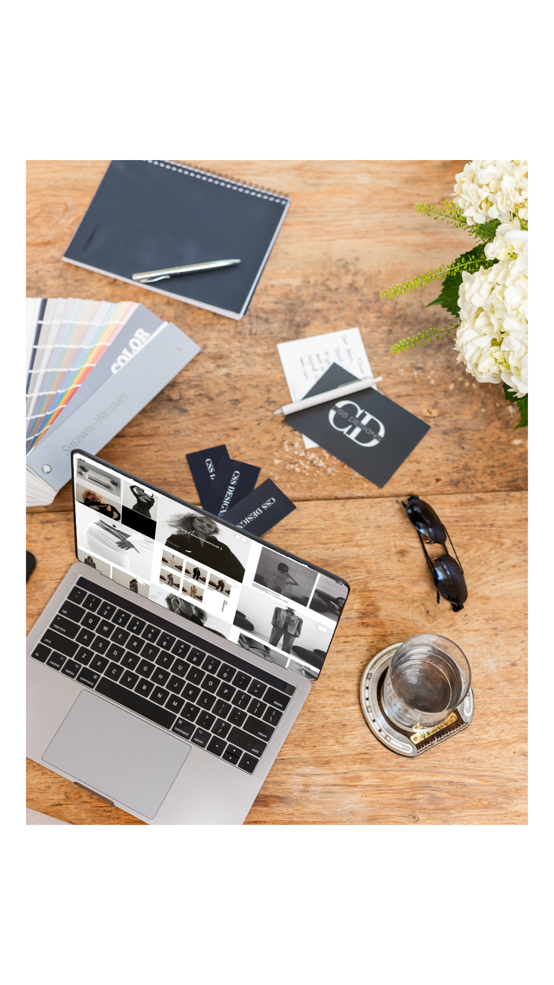
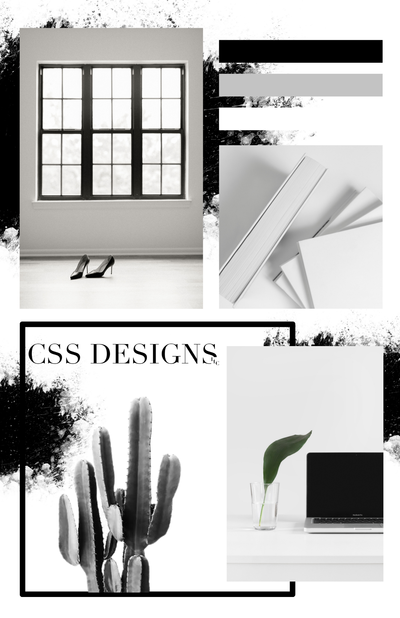
The one above is an example of a tile-like layout - each image spaced evenly. Your board can be read as clean, sophisticated, and purposeful when there are less images arranged in a grid-like form. Harmoniously placed with balanced elements, you find your eye moving across the board to notice all features, which brings me to my next point.
Deciding where to put an image can be a long process, especially when you have an eye for detail and you just caaan't find that perfect spot! The best way to decide on your first image, and where it should go with surrounding others, is by asking yourself what/where you want to focal point. This placement will probably change a few times, even up until the completion of your board - but that's normal! This is where sizing comes into play. The largest image or element on your board will almost always be the focal point, so make sure you're choosing one that makes sense, and sizing the others accordingly per what mood you're evoking.
Keep this checklist in mind when you're creating your mood board:
- Textural element: An image with texture assists in displaying a certain feeling; if there is an image of silk or lightweight fabric, it might remind you of luxury, peacefulness, or serenity. A more rigid texture might remind you of strength, a particular pattern, or anger.
- Color element: One of the most obvious elements, the colors and tones you choose, can have the largest effect on how your board reads. Make sure to stay within a certain palette or range of colors and emphasize the shade closest to the emotion you're trying to elicit. Learn more on colors by reading our Color Psychology Blog.
- Conceptual element: Leave room for an image(s) that aren't necessarily directly representing your concept. Conceptual elements can be more than an image, it can be the way certain colors are displayed, (i.e. instead of showing swatches in a rectangle, they are circular or a paint brush stroke) or a relatable object.
- Literal element: While the rest of your images are open to interpretation having a literal element relating to your concept can help steer the viewers in the right direction. For example, if you're creating a mood board for a fashion line, having 1-2 literal fashion images would be plenty for the viewer to understand what the board is representing.
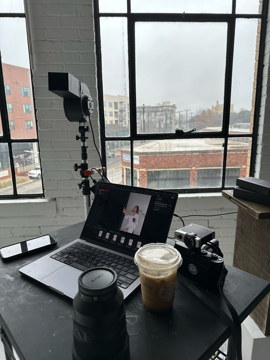
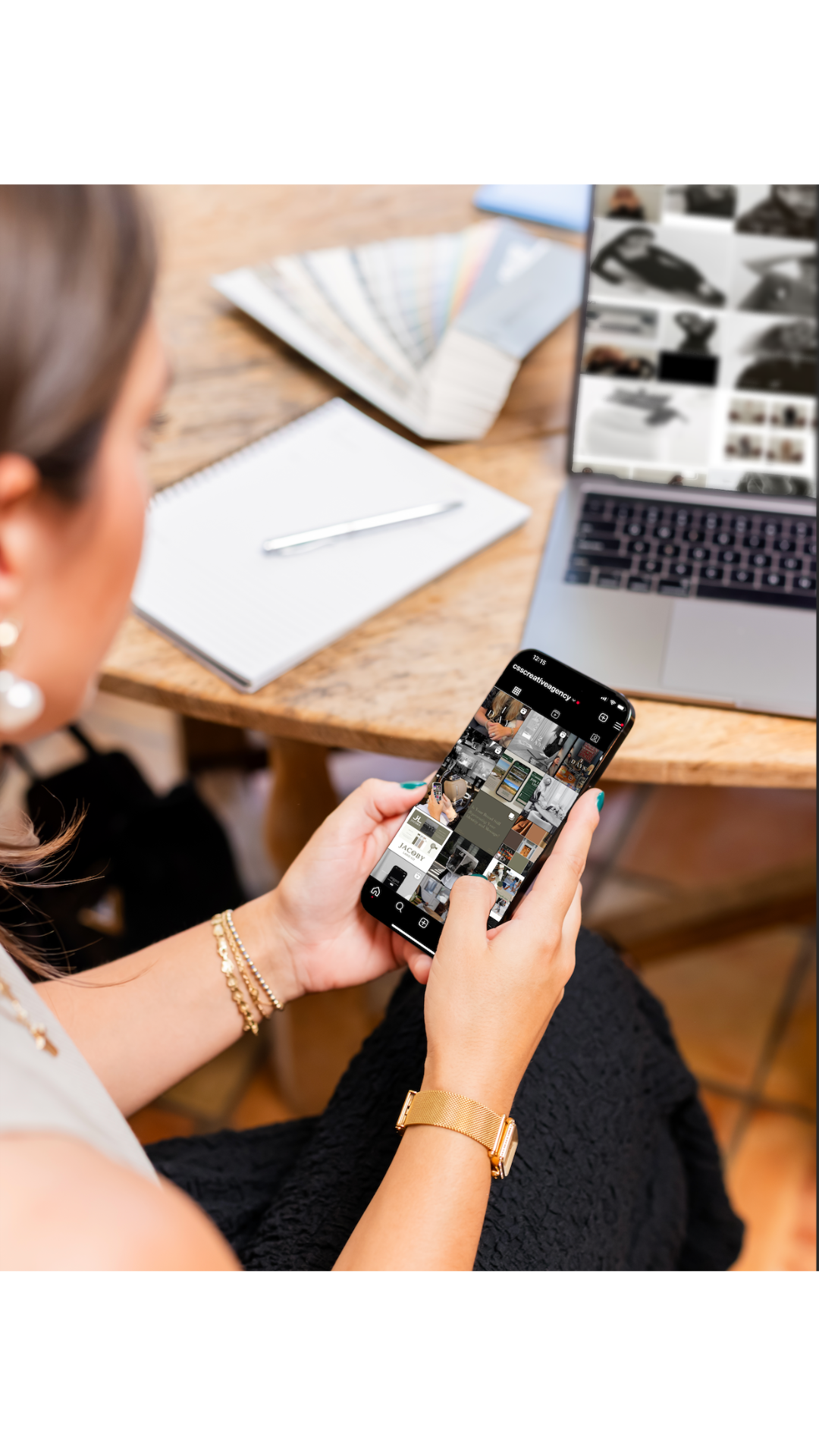
We love to create mood and concept boards for our clients before and after working with them. You can view some of our branding mood boards here on our portfolio page. Especially with new marketing clients, while we mock-up social media strategy we also love creating mood boards to understand what direction the client, and we want to go in conceptually. Let us know if you'd like to see more behind the scenes work on our end, and I hope you implement these aspects into your next board!
Xx,
Chase