Trick or Treat! Is your website messy, or neat?
Your website is at the forefront of your brand and business. How your site reads and the navigation flows will make or break it... from cluttered pages to non-mobile-friendly design we've come up with 4 things you will want to avoid when building a website. Beware!
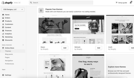
- Avoid: Forgetting to make your site mobile-friendly. While desktop view and how your site displays will always be important, it is just as if not more important to have a site that's mobile-friendly. When choosing a theme for your website, and working on the back end of Shopify, there is always an option to preview the choice in a mobile format. Adding to your list of something to think about when designing a site, specific coding and theme details can differ between desktop and mobile view. So... beware when designing a desktop AND mobile-friendly site!
- Avoid: Adding too much information or content to one page. One of the more basic rules, yet the most overlooked is cluttering your pages with too much information. This includes making your web pages too long and causing the consumer to scroll and scroll until they click off of your site. Navigation menus with drop-down options under each parent collection are much more user-friendly, and a promising experience for the reader to keep them engaged. Website visitors have little to no patience when they click into a new site, so the home page is your time to prove your value.
- Avoid: Poorly timed pop-ups. Circling back to a message we always promote - you have 3-4 seconds to capture a website visitor's attention, it might not always be the best time for a pop-up.. it depends! Studies show holding off a bit until the visitor has spent some time on the site can also be beneficial in obtaining engagement. One of the best ways to entice engagement is to invite visitors to click through without interrupting the user experience.
- Avoid: Too much text that obscures the overall message. Needless to say, website copy is EXTREMELY important! And by website copy, I don't just mean your bio... it's any and all verbiage on your site - that includes headings and subheadings too! Find a balance that works with the service or product you're offering, and connect your story to the name. Keep in mind spacing, kerning, typography and the length of verbiage on each page compared to it's purpose.
At CSS Designs we specialize in all things web design, branding, and marketing. Whether you are looking to launch your first website or seeking a complete brand refresh, CSS Designs is here to help elevate your business to the next level. We love sharing our knowledge and teaching our clients every step of the way. Personalization is at the heart of our work and we approach each client and project individually, curating a customized, white-glove experience that best fits you and your brand.
Xx,
Chase


