Flo-Tex Oil Company
Brand Design
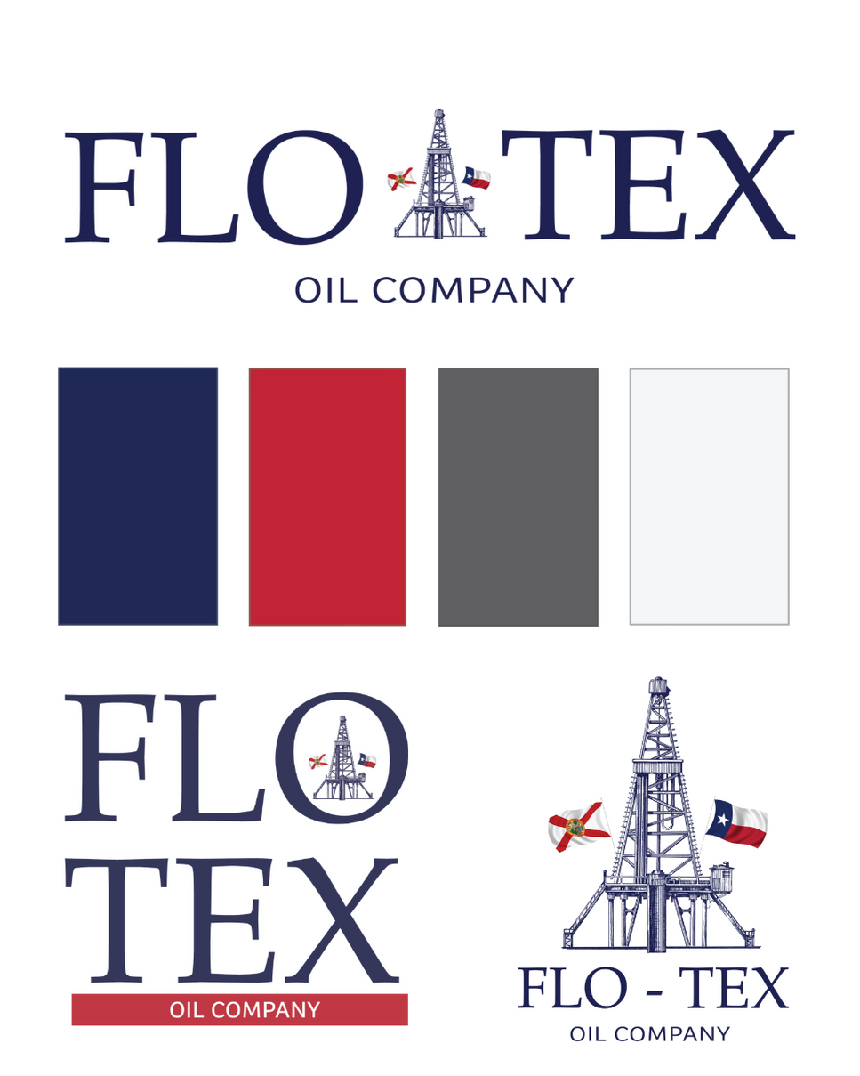
Flo-Tex Oil Company needed a visual identity that felt as strong and rooted as its operations. From the start, our goal was to capture the brand’s bold presence in the energy sector while subtly honoring its regional footprint—spanning Texas and Florida.

Designing the brand.
With rich navy tones, a crisp red accent, and a custom oil derrick illustration flying both state flags, the Flo-Tex logo delivers on strength and precision. Every element, from typography to color hierarchy, was chosen to feel grounded, technical, and unmistakably regional—mirroring the integrity and grit that define the company’s work.
The brand system balances utility with heritage, delivering flexibility for both digital and print environments. Whether stamped on equipment, stitched on uniforms, or displayed across digital campaigns, the visual identity reinforces Flo-Tex’s values: tradition, trust, and long-term performance.
Strength. Heritage. Precision.


